Tabs & Components
Assemble the project view from components — the construction kit behind the tabs
The project view is a construction kit: which tabs exist, what is on them and who may see what is configured by administrators under System → Projects in the Tab Settings and Component Settings tabs (permission Project settings). Changes affect all projects.
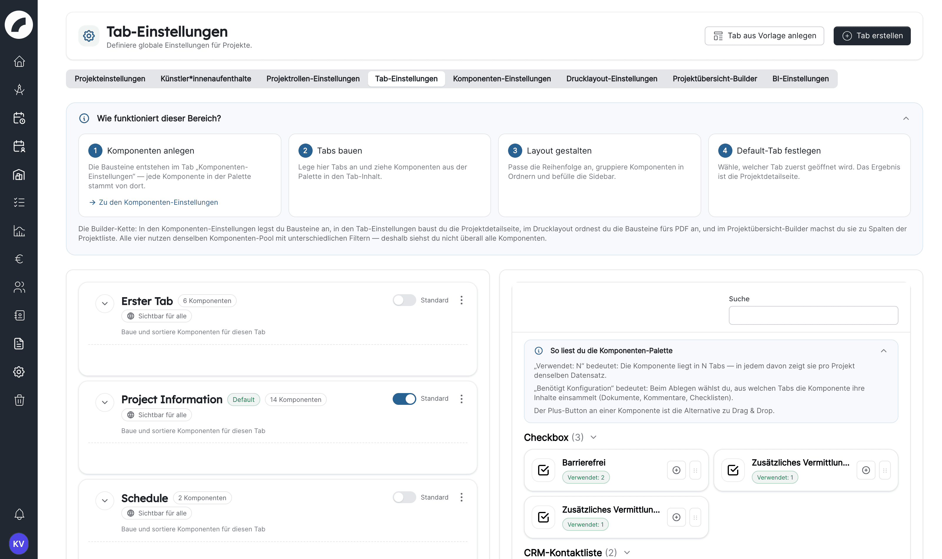
Managing tabs
-
Create tab adds a new tab; name and order are up to you — the order is sorted via drag & drop.
-
A tab can be marked as the default tab via Set as default tab: it opens when someone opens a project. In addition, every tab shows its visibility ("Visible for all" or restricted, see Restricting and deleting tabs).
-
Every tab contains an ordered list of components; it can additionally have sidebar tabs — narrow sub-sections on the right (in the default setup e.g. project information, shift information, budget information).
-
Folder components (collapsible containers) group components into expandable/collapsible sections. Folders cannot be nested, and the large tools do not fit into them: Calendar, Shifts, Budget, Bulk Event Create Component, Artwork-Tickets as well as All Checklists, All Comments and All Documents.
-
Create tab from template next to Create tab adds a fully equipped tab. Every template has a description; templates with a sidebar show Including sidebar with the names of the sidebar tabs, and Show components lists all components of the template in advance. You can choose from:
- the default tabs Project Information (with the orange sections Descriptions for the text areas Short description, Website text and Press & public relations, and Documents with the file upload), Schedule, Checklists, Shifts, Budget and Comments. Each comes with a sidebar: Shifts with Shift information, Budget with Budget information, all others with Project Information. This is handy if a default tab was deleted by mistake or a new venue wants to start with the proven layout;
- the Production inquiry template: an inquiry form with coloured sections for contact & company, artists (with the CRM contact list Names of everyone arriving), general information, documents (file upload), music & rights, anything else, texts & description, marketing material: images & video, and sponsors & partners. It has no sidebar and is meant for collecting data from guest performances, also in combination with external access.
The result is always a normal tab: the template only saves you the manual setup, and you can rename, rearrange, extend or delete the components like any other. The new tab is placed at the end of the tab bar and is visible to everyone. Its texts and field names are created in the language of the person who creates it. Text fields, section titles and the CRM contact list are created as new custom components each time: if you apply the same template twice, these fields exist twice, with separate contents. Standard components such as the file upload or the budget are reused instead.
All project tabs follow a uniform, left-anchored layout: tools such as calendar, shifts, budget and schedule always run across the full width, tables and lists in a uniform column, text and form components in reading width.
Placing components in a tab
To the right of the tabs is the palette with all components, grouped by type and with a search field. You drag a component to the desired place via drag & drop or use the plus button on the component: the Add component window offers Add to this tab, Add to folder and Add to sidebar and appends the component to the end of the selected area.
- Used: N on a component means it is placed in N tabs. In every one of them it shows the same data record per project.
- Requires configuration is shown on File upload, Comments and Checklist. When you drop the component you choose which tabs it collects its content from: Only include current tab or a selection of several tabs. For the file upload you change the selection later on the placement (see File upload and upload areas). To change it for Comments and Checklist, remove them from the tab and place them again.
- You fill the sidebar of a tab via Add sidebar tab. Folders and some components cannot be placed there.
Restricting and deleting tabs
In the Create tab or Edit tab window you define the visibility in addition to the name. With Visible for all, everyone who may open the project sees the tab. If you switch the option off, you select users and teams; only they and admins then still see the tab. A restricted tab cannot be opened via its direct address either. If you select nobody, nobody except admins sees it.
Delete tab asks for confirmation first. The following applies:
- The last tab cannot be deleted; at least one project tab must be available.
- The components themselves and their values in the projects are kept. Only their placement in this tab is removed.
- Comments, checklists and documents of a tab that is visible for all stay visible for all. For a restricted tab, only admins see them afterwards.
A tab should represent one clear work context, such as communications, technical planning, or finance. Details needed almost everywhere are often better placed in the sidebar. The default tab should contain what most users need first when opening a project.
The components
Two families:
Custom components
Freely creatable contents that are filled in per project. You create them under Component settings with Create a new component and then drag them into a tab. You can create as many of the same type as you like, for example one CRM contact list “Arriving people” and a second one “Artists”. The type cannot be changed after creation. An update does not create custom components: new types only become available for selection. A component marked 0× exists but is not placed in any tab yet and is therefore not visible anywhere.
| Component | Contents |
|---|---|
| Title | Heading with selectable font size, an optional Text below the heading and an optional Section bar in a color of your choice |
| Text Field / Text Area | Single- or multi-line text |
| Checkbox | Yes/no marker, activated by default if desired |
| Drop Down | Predefined options, optionally with a default. Allow multiple selection permits several values per project. |
| Multiple choice (checkboxes) | Predefined options as checkboxes, several values per project, optionally with Default options |
| Link / Link List | A single link or a collection; the link list has an upper limit (Max links) |
| Separator | Spacing with adjustable height, with Show a separator line if desired |
| Folder component | Collapsible container for other components |
| CRM contact list | CRM contacts in the project, such as arriving people, see CRM contact list |
For text field, text area and link components, the configured placeholder is a real placeholder: it appears in the empty field and disappears as soon as something is entered. A component therefore needs its own label in the component settings if it should be named permanently.
You reorder the options of drop-downs and multiple-choice components in the component settings by dragging, without deleting them. Allow multiple selection can only be switched off again as long as no project has selected several values.
Deleting removes the project values
If you delete a custom component in the component settings, all values already entered in projects are removed as well. If a component should only disappear from one tab, remove it there in the tab settings. Special components cannot be deleted.
CRM contact list
A CRM contact list collects CRM contacts in the project, for example the people arriving for a guest performance. In the component settings you define, besides Title and Hint text:
- Allowed contact types: Only contacts of these types can be created or linked in the list. Each type gets its own button in the project with the form based on its CRM properties. Without a selection, all contact types are allowed. Freelancers and service providers are maintained in their own profile; they can only be linked, and only if you select them explicitly.
- Maximum number of contacts (optional): Empty means no limit.
- Use roles New in 1.9.0: Contacts are grouped in the project by roles you name freely. The special role Artist shows a person as an artist of the project everywhere, for example in the calendar, the duty roster and exports.
In the project you add contacts with Add ‹contact type› or with Link existing CRM contact. Removing a contact from the list does not delete it from the CRM. External people can also fill the list.
Standard components
Ready-made function blocks, called Special components in the interface. Each exists exactly once and can be placed in one or more tabs. The name in the palette is given in brackets where it differs. The most important ones:
| Component | Function |
|---|---|
| Project title / base data (Project basic data) / project status | The project's header data |
| Project properties (Project Attributes) | Category, genre, sector |
| Project team | Team list with rights and roles |
| Project group display (Project Group, Project group display component, Component Subprojects) | Group ↔ member projects |
| Calendar tab (Calendar) | The project calendar |
| Schedule (Bulk Event Create Component) | Tabular bulk event creation |
| Project period | Automatically calculated time range |
| Checklist / All checklists | One specific or all checklists |
| Shift tab (Shifts), Shift Contact Persons, General Shift Information, Relevant Dates For Shift Planning | The project's shift planning |
| Budget tab (Budget), Project Budget Deadline, Budget Informations | The project budget |
| Sage invoice overview | Special component: all Sage bookings of the project, only with an active Sage integration. It is created during the update and must be dragged into a tab once. |
| Comments / All comments | Discussions |
| File upload / All Documents | Files on the project, see File upload and upload areas |
| Document request | Contracts and document requests of the project |
| Artists, Artist residencies | Artist data and residencies |
| Material issue (Project material issue) | Link to the inventory |
| Business Intelligence, BI key figures | Business intelligence data |
| Artwork-Tickets | Ticket sales for the events of the project. The component is only offered if your instance is connected to Artwork-Tickets. |
Many standard components expose connected data in a project context. The period is calculated from calendar events, the shift tab opens the global duty-roster logic for this project, and material issue links to inventory. Consider the workflow a component starts as well as its appearance.
File upload and upload areas
Every placement of the File upload component in a tab or folder is its own upload area. It shows the files of the tabs you select when placing it.
- Default visibility: A new file appears in all upload areas whose tab selection contains the tab in which it was uploaded.
- Changing the tab selection: In the tab settings the placement has the line Shows documents from tabs with Edit (window Edit tab selection). If the file upload sits in a folder, remove it and place it again instead.
- Upload settings: Per area, Edit in the line Upload settings limits the allowed file types (Only allow certain file types), the Maximum file size (MB) and the Maximum number of files per project. Empty fields mean no additional limit. Only file types and sizes within the file settings can be chosen. The number counts the files uploaded via this area. The limits are shown in the project below the upload field.
- Redistributing in the project: If there are several upload areas, New files visible in lets you decide before uploading where new files appear. On every file a badge shows Only here or Also in n other area(s). Clicking it opens Visible in, where you choose the areas for this file or reset it to the standard. At least one area must stay selected. This requires write permission in the project.
Independently of this, All Documents shows all files of the project from the tabs the respective person may see. Examples for dividing things up and protecting confidential files are under Distributing documents deliberately.
One component in several tabs
Every component – your own as well as the standard ones – may sit in several tabs and shows the same record of the project there. A field placed in the Technology and Production tabs is therefore maintained only once. Permissions apply to the component and thus in all tabs; for different rights you need a separate component. Examples and how to handle documents in restricted tabs are described in Setting up the project view.
One component, one place
The "all …" variants (all checklists, all comments, all documents) show the project's entire contents. The single variants only show the contents of the tabs you select when placing them, in the simplest case only those of their own tab. So, for example, every craft can have its own tab with its own checklist and its own comments.
Visibility & write permissions per component
Basic rule: seeing a component always requires access to the project, editing always requires write permission in the project (the Write permission or Project management checkbox in the project team or the global permission Write all projects). The settings in the component settings can narrow this circle further, but never extend it. Per component you choose:
| Setting | Meaning |
|---|---|
| No further restriction | Visible to everyone with project access, editable by everyone with write permission in the project |
| Visible to everyone with project access, but editing is additionally limited to … | Readable by everyone in the project; editable only by the named users or departments — and only if they also have write permission in the project |
| Only visible to the following … | Visible only to the named ones; editing additionally requires write permission in the project |
This way the budget information, for example, stays reserved for the administration while everyone sees the short description. For Title, Separator, Shifts, Budget and Calendar this setting does not exist: titles and separators carry no content, and access to shifts, budget and calendar follows the user permissions and the project (for example the Budget access checkbox in the project team). Admins always see every component. The permission Write all projects only lifts the editing restriction of components a person can see – “Only visible to the following” also applies to these users. The rules are also checked on the server — they match exactly what the interface offers. The content of a component a person may not see is never sent to their browser and does not appear in print layouts either.
In the component dialog an info icon on every field explains what it does; the texts depend on the component type.
External accesses see the whole tab
If a tab is shared via an external access, the internal visibility settings of the components do not apply to the invited person. They see all custom components of the tab (title, text field, text area, checkbox, dropdown, multiple choice, link, link list, separator, folder, CRM contact list) plus the standard components Project title, Project basic data, Artists and File upload. They do not get to see any other standard component, such as project team, comments, checklists, calendar, shifts or budget. With write access they can fill in the custom input components, the CRM contact list and, if Allow file upload for external accesses is enabled, the file upload; project title, basic data and artists stay read-only for them. Create a dedicated tab for exchanging data with externals, for example from the Production inquiry template.
Checking visibility
Tab visibility, the project permission and the permission of the individual component work together: a person needs access to the project, to the tab and to the component within it; editing additionally requires write permission in the project. Specialist permissions can additionally apply to budgets, contracts, or material issues. After larger changes, check the result with a typical project-team role (with and without write permission), an administration role and an external-access role.
Introducing changes safely
- Define the purpose and audience of the new tab or field.
- Reuse a standard component or create a clearly named custom one.
- Assign view and write permissions deliberately.
- Place it in a clear location and test it with an existing project.
- Inform teams when names, ordering, or expected workflows change.
Recommendation: start small
The shipped setup (project information, schedule, checklists, shifts, budget, comments) covers most venues. It has proven best to create new tabs only once a department repeatedly needs contents of its own: every additional tab is one more click for everyone.
Last updated on